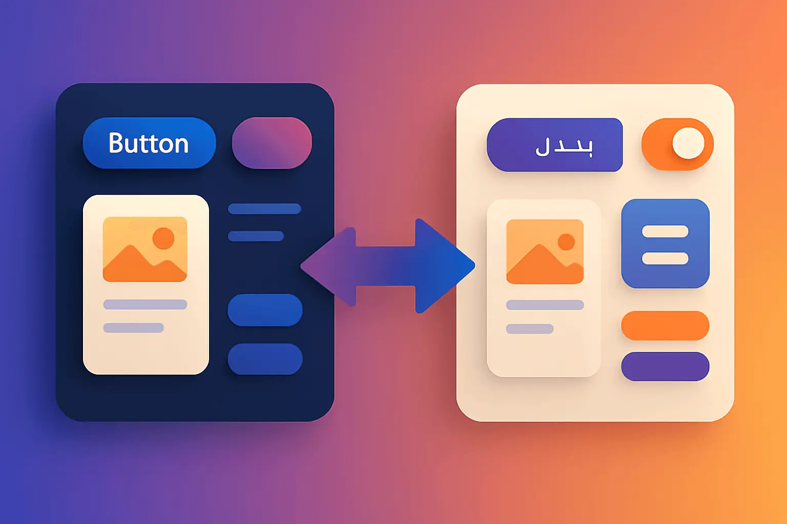
Building Bulletproof RTL Design Systems: The Complete Guide to Bidirectional Excellence
Posted by Nuno Marques on 31 Oct 2025
Introduction
Supporting Right-to-Left (RTL) languages isn't just about flipping your interface horizontally—it's about creating an experience that feels native to Arabic, Hebrew, Persian, and Urdu speakers. With over 600 million people speaking RTL languages globally, and Arabic being one of the most widely-spoken languages in the world, getting RTL right is critical for governmental platforms serving diverse populations.
This guide is your comprehensive checklist for building a design system that handles both LTR (Left-to-Right) and RTL seamlessly. Whether you're building from scratch or retrofitting an existing system, these battle-tested practices will help you avoid common pitfalls and deliver a truly bidirectional experience.
Table of Contents
- Core Principles: Mirroring vs. Not Mirroring
- Layout & Structure
- Typography & Text Handling
- Icons: The Art of Selective Flipping
- Navigation Components
- Form Elements
- CSS Logical Properties: Your Best Friend
- Component-by-Component Breakdown
- Numbers, Dates & Bidirectional Content
- Animations & Transitions
- Shadows & Visual Effects
- Data Visualization
- Accessibility in RTL
- Testing Strategies
- Common Pitfalls & Quick Wins
1. Core Principles: Mirroring vs. Not Mirroring
✅ ALWAYS Mirror These Elements:
- Layout flow: Main content, sidebars, navigation
- Directional icons: Back/forward arrows, chevrons, breadcrumb separators
- Reading order: Left-aligned becomes right-aligned
- Margins and padding: Left becomes right and vice versa
- Float directions
- Text alignment
- Progress indicators: Horizontal progress bars
- Pagination controls
- Tabs: Icon positions relative to labels
- Tooltips and popovers: Positioning and arrows
- Horizontal scrollbars
- Carousels and sliders: Direction of movement
- Drawer/sidebar position
❌ NEVER Mirror These Elements:
- Brand logos: Keep original orientation
- Clocks and time: Always clockwise
- Media controls: Play, pause, forward, rewind buttons represent physical tape direction
- Charts with time axis: Time progresses left-to-right universally
- Download/upload icons: Symmetrical, represent gravity
- Search icons: Magnifying glass
- User avatar placeholders
- Video thumbnails
- Checkmarks: Universal symbol
- Universal symbols: Settings (gear), home, trash, shopping cart
- Physical objects: Items held in right hand (scissors, hammers, etc.)
- Numbers: Digits never reverse (123 stays 123)
- Punctuation: Most punctuation except Arabic-specific ones
🤔 Context-Dependent (Requires Judgment):
- Question marks: Arabic uses ؟ (mirrored), Hebrew uses standard ?
- Icons with text: May need separate localized versions
- Quotation marks: Language-specific (« » for some, " " for others)
2. Layout & Structure
HTML Direction Attribute
<!-- Set the direction at the root -->
<html dir="rtl" lang="ar">
Key Layout Considerations
✅ DO:
- Use
dir="rtl"on the<html>element - Use
dir="auto"for content that might mix RTL and LTR - Design navigation to start from the right
- Place primary actions on the right side
- Mirror grid column order
- Consider that scrollbars may appear on the left in some browsers
❌ DON'T:
- Hardcode physical directions (left/right) in your design system tokens
- Assume all RTL users have scrollbars on the left (they don't in all browsers/OS)
- Forget about mobile: swipe gestures should also feel natural
Responsive Considerations
/* The layout should respond to direction changes */
.container {
  display: grid;
  grid-template-columns: 1fr 3fr;
}

[dir="rtl"] .container {
  /* Columns automatically reverse with CSS Grid */
  /* But be careful with named areas */
  grid-template-areas: "sidebar main";
}
3. Typography & Text Handling
Arabic-Specific Challenges
Line Height:
/* Arabic characters tend to be taller and require more line height */
[lang="ar"] {
  line-height: 1.8; /* vs. 1.5 for English */
}
Letter Spacing:
/* NEVER use letter-spacing with Arabic! */
/* Arabic is cursive - characters connect */
[lang="ar"] {
  letter-spacing: 0; /* Keep this at 0 */
}
Font Selection:
/* Use proper Arabic fonts */
[lang="ar"] {
  font-family: "Noto Sans Arabic", "Tahoma", sans-serif;
}

[lang="he"] {
  font-family: "Noto Sans Hebrew", "Arial", sans-serif;
}
Text Alignment
✅ DO:
.text {
  text-align: start; /* Not 'left' or 'right' */
}
❌ DON'T:
.text {
  text-align: left; /* Will break in RTL */
}
Vertical Overflow & Text Truncation
/* Arabic text tends to be longer than English */
.truncated-text {
  overflow: hidden;
  text-overflow: ellipsis;
  white-space: nowrap;
  /* Allow more space for Arabic */
}

[lang="ar"] .truncated-text {
  max-width: 120%; /* Adjust based on average expansion */
}
Typography Checklist
- No letter-spacing on Arabic text
- Increased line-height for Arabic (1.7-1.8)
- Proper font families that support the script
- Text alignment uses logical properties (start/end)
- No all-caps for Arabic (there are no capital letters)
- Consider text expansion (Arabic can be 25-30% longer)
- Test text wrapping and word breaks
- Ensure proper rendering of diacritics
- Underline alternative in Arabic: overline (ـــ) is traditional emphasis
4. Icons: The Art of Selective Flipping
The Three Types of Icons
1. Directional Icons (MUST flip)
These represent movement or direction in time/space:
/* Flip directional icons */
[dir="rtl"] .icon-arrow,
[dir="rtl"] .icon-chevron,
[dir="rtl"] .icon-back,
[dir="rtl"] .icon-forward,
[dir="rtl"] .icon-redo,
[dir="rtl"] .icon-undo {
  transform: scaleX(-1);
}
Examples:
- ← → arrows (navigation, back/forward)
- ⟨ ⟩ chevrons (dropdowns, accordions)
- ↷ ↶ redo/undo
- 📤 📥 send/receive (in some contexts)
- Charts showing trends
- Breadcrumb separators
2. Symmetrical Icons (DON'T flip)
/* These icons don't need flipping */
.icon-search,
.icon-settings,
.icon-close,
.icon-check,
.icon-warning,
.icon-info,
.icon-user {
  /* No transform needed */
}
Examples:
- ⚙️ Settings (gear)
- 🔍 Search (magnifying glass)
- ❌ Close/delete
- ✓ Checkmark
- ⚠️ Warning
- ℹ️ Information
- 👤 User avatar
- 🗑️ Trash
- ⬇️ Download (gravity is universal)
3. Physical Object Icons (DON'T flip if held in right hand)
Rule: If most people hold it in their right hand, don't flip it.
/* Right-hand objects - keep them as is */
.icon-volume,
.icon-microphone,
.icon-scissors {
  /* Most people are right-handed, keep these on the right */
}
Icon Implementation Pattern
React/Component Example:
const Icon = ({ name, className, noFlip = false }) => {
  const shouldFlip = !noFlip && isDirectionalIcon(name);

  return (
    <i
      className={cn(
        `icon-${name}`,
        shouldFlip && 'flip-rtl',
        className
      )}
    />
  );
};

// Usage
<Icon name="arrow-right" /> {/* Will flip in RTL */}
<Icon name="search" noFlip /> {/* Won't flip */}
CSS Implementation:
/* Create a flip utility */
[dir="rtl"] .flip-rtl {
  transform: scaleX(-1);
}

/* Or be specific */
[dir="rtl"] .icon-chevron-right {
  transform: scaleX(-1);
}
Icon Checklist
- Classify all icons into the three categories
- Create a flip utility class
- Document which icons flip and why
- Consider creating separate RTL icon assets for complex icons with text
- Test icon clarity after flipping (some icons lose meaning)
- Ensure icon size and positioning work in both directions
5. Navigation Components
Breadcrumbs
✅ Correct RTL Breadcrumbs:
<!-- LTR: Home > Products > Electronics -->
<!-- RTL: Electronics < Products < Home -->

<nav aria-label="Breadcrumb">
  <ol class="breadcrumbs">
    <li><a href="/">Home</a></li>
    <li><a href="/products">Products</a></li>
    <li aria-current="page">Electronics</li>
  </ol>
</nav>
.breadcrumbs {
  display: flex;
  gap: 0.5rem;
}

.breadcrumbs li:not(:last-child)::after {
  content: "›";
  margin-inline-start: 0.5rem;
  color: var(--gray-500);
}

[dir="rtl"] .breadcrumbs li:not(:last-child)::after {
  content: "‹";
}
Pagination
✅ Correct Pattern:
<!-- LTR: « Previous 1 2 3 Next » -->
<!-- RTL: « Next 1 2 3 Previous » -->

<nav aria-label="Pagination">
  <ul class="pagination">
    <li><a href="#" rel="prev">Previous</a></li>
    <li><a href="#">1</a></li>
    <li><a href="#" aria-current="page">2</a></li>
    <li><a href="#">3</a></li>
    <li><a href="#" rel="next">Next</a></li>
  </ul>
</nav>
Key Points:
- "Previous" and "Next" buttons swap positions
- Page numbers stay in the same order (1, 2, 3)
- Arrows flip direction
- ARIA labels should be translated appropriately
Top Navigation Bar
.header {
  display: flex;
  justify-content: space-between;
}

.nav-start {
  /* Logo area - position based on direction */
  margin-inline-end: auto;
}

.nav-end {
  /* User menu, notifications */
  margin-inline-start: auto;
}
Mobile Menu (Hamburger)
✅ DO:
- Place hamburger menu on the opposite side in RTL (right side)
- Slide-in animations should come from the right in RTL
- Swipe gestures should feel natural (swipe from right to open in RTL)
.mobile-menu-button {
  /* Position dynamically based on direction */
  inset-inline-start: 1rem; /* Left in LTR, right in RTL */
}

[dir="rtl"] .mobile-menu {
  /* Slide in from the right */
  transform: translateX(100%);
}

[dir="rtl"] .mobile-menu.open {
  transform: translateX(0);
}
6. Form Elements
Input Fields
Text Alignment:
input[type="text"],
input[type="email"],
textarea {
  text-align: start; /* Aligns based on content direction */
}

/* Special case: Email and URL inputs should always be LTR */
input[type="email"],
input[type="url"] {
  direction: ltr;
  text-align: left;
}
Labels and Placeholders:
label {
  display: block;
  margin-block-end: 0.5rem;
  text-align: start;
}

/* Placeholder text should align with content */
::placeholder {
  text-align: start;
}

/* Special case: If placeholder is RTL in LTR context */
[dir="ltr"] input[placeholder][lang="ar"]::placeholder {
  text-align: right;
}
Form Icons
.form-field {
  position: relative;
}

.form-field__icon {
  position: absolute;
  inset-block-start: 50%;
  inset-inline-start: 1rem; /* Swaps automatically */
  transform: translateY(-50%);
}

.form-field__input {
  padding-inline-start: 3rem; /* Space for icon */
}
Search Fields
.search-input {
  background-image: url('search-icon.svg');
  background-position: right 1rem center; /* Won't work in RTL! */
  padding-right: 3rem;
}

/* ✅ Better approach */
.search-field {
  position: relative;
}

.search-field__icon {
  position: absolute;
  inset-inline-end: 1rem; /* Right in LTR, left in RTL */
  inset-block-start: 50%;
  transform: translateY(-50%);
}

.search-field__input {
  padding-inline-end: 3rem;
}
Validation Messages
.form-error {
  display: flex;
  gap: 0.5rem;
  margin-block-start: 0.25rem;
  color: var(--error-color);
}

.form-error__icon {
  /* Icon stays at the start of the error message */
  flex-shrink: 0;
}
Best Practices:
-
✅ Display error messages ABOVE the input field (not below)
- Avoids issues with auto-fill, virtual keyboards, and magnification software
-
✅ Use icons + color (not just color) for accessibility
-
✅ Keep error messages visible while user corrects the error
-
❌ Don't rely on toast notifications for form errors
Checkboxes and Radio Buttons
.checkbox-label {
  display: flex;
  align-items: center;
  gap: 0.75rem;
}

.checkbox-label input {
  /* Checkbox appears at the start (right in RTL, left in LTR) */
  order: -1;
}

/* OR use logical properties */
.checkbox {
  margin-inline-end: 0.75rem;
}
Form Layout
.form-row {
  display: grid;
  grid-template-columns: 200px 1fr;
  gap: 1rem;
  align-items: start;
}

/* In RTL, the label column is on the right */
/* This happens automatically with CSS Grid */
7. CSS Logical Properties: Your Best Friend
Why Logical Properties?
Instead of:
/* ❌ Physical properties - breaks in RTL */
.card {
  margin-left: 1rem;
  padding-right: 2rem;
  border-left: 2px solid blue;
  float: left;
}
Use:
/* ✅ Logical properties - works in both directions */
.card {
  margin-inline-start: 1rem;
  padding-inline-end: 2rem;
  border-inline-start: 2px solid blue;
  float: inline-start;
}
Key Logical Properties Reference
Margins
margin-inline-start    /* margin-left in LTR, margin-right in RTL */
margin-inline-end      /* margin-right in LTR, margin-left in RTL */
margin-block-start     /* margin-top */
margin-block-end       /* margin-bottom */
margin-inline          /* margin-left + margin-right */
margin-block           /* margin-top + margin-bottom */
Padding
padding-inline-start   /* padding-left in LTR, padding-right in RTL */
padding-inline-end     /* padding-right in LTR, padding-left in RTL */
padding-block-start    /* padding-top */
padding-block-end      /* padding-bottom */
padding-inline         /* padding-left + padding-right */
padding-block          /* padding-top + padding-bottom */
Border
border-inline-start    /* border-left in LTR, border-right in RTL */
border-inline-end      /* border-right in LTR, border-left in RTL */
border-block-start     /* border-top */
border-block-end       /* border-bottom */
Positioning
inset-inline-start     /* left in LTR, right in RTL */
inset-inline-end       /* right in LTR, left in RTL */
inset-block-start      /* top */
inset-block-end        /* bottom */

/* Shorthand */
inset: logical 10px 20px 30px 40px;
/* = block-start, inline-start, block-end, inline-end */
Text Alignment
text-align: start;     /* left in LTR, right in RTL */
text-align: end;       /* right in LTR, left in RTL */
Float
float: inline-start;   /* left in LTR, right in RTL */
float: inline-end;     /* right in LTR, left in RTL */
Browser Support Strategy
/* Provide fallbacks for older browsers */
.element {
  /* Fallback */
  margin-left: 1rem;
  padding-right: 2rem;

  /* Override with logical properties */
  margin-inline-start: 1rem;
  padding-inline-end: 2rem;
}

/* Or use @supports */
@supports (margin-inline-start: 1rem) {
  .element {
    margin-left: 0; /* Reset physical property */
    margin-inline-start: 1rem;
  }
}
Migration Strategy
- Audit existing CSS for physical properties
- Create a mapping document (left → inline-start, etc.)
- Replace gradually, starting with layout components
- Test thoroughly in both directions
- Document exceptions where physical properties are intentional
8. Component-by-Component Breakdown
Modals & Dialogs
.modal {
  /* Center the modal */
  position: fixed;
  inset: 0;
  display: flex;
  align-items: center;
  justify-content: center;
}

.modal__content {
  /* Modal content doesn't need special RTL handling */
  /* unless it contains directional elements */
  max-width: 600px;
  padding: 2rem;
}

.modal__close {
  position: absolute;
  /* Close button at the end (top-right in LTR, top-left in RTL) */
  inset-block-start: 1rem;
  inset-inline-end: 1rem;
}

.modal__actions {
  display: flex;
  gap: 1rem;
  justify-content: flex-end; /* Stays at the end in both directions */
}
Checklist:
- Close button positioned using logical properties
- Modal title and content text aligned to
start - Action buttons flow naturally (primary on the end)
- Any icons within the modal flip appropriately
- Confirm overlay click behavior is intuitive
Dropdowns & Comboboxes
.dropdown {
  position: relative;
}

.dropdown__menu {
  position: absolute;
  /* Align to the start edge of the trigger */
  inset-block-start: 100%;
  inset-inline-start: 0;
  min-width: 200px;
  margin-block-start: 0.25rem;
}

/* If dropdown is at the end of a row */
.dropdown--end .dropdown__menu {
  inset-inline-start: auto;
  inset-inline-end: 0;
}
Key Points:
- ✅ Dropdown arrows flip in RTL
- ✅ Menu positioning relative to trigger element
- ✅ Scrollbar position (may be on left in some browsers)
- ✅ Keyboard navigation (arrow keys still work directionally)
- ✅ Multi-select checkboxes aligned properly
Date Pickers & Time Pickers
Calendar Grid:
<!-- Week starts on Saturday in many Arabic countries -->
<!-- vs. Sunday/Monday in other regions -->

<div class="calendar">
  <div class="calendar__header">
    <button class="calendar__prev">‹</button>
    <div class="calendar__month">March 2025</div>
    <button class="calendar__next">›</button>
  </div>
  <div class="calendar__grid">
    <!-- In RTL, Saturday column is on the right -->
  </div>
</div>
.calendar__header {
  display: flex;
  justify-content: space-between;
  align-items: center;
}

[dir="rtl"] .calendar__prev,
[dir="rtl"] .calendar__next {
  transform: scaleX(-1); /* Flip the arrows */
}

.calendar__grid {
  display: grid;
  grid-template-columns: repeat(7, 1fr);
  /* Columns automatically flip with grid in RTL */
}
Important Date Considerations:
- ✅ First day of week varies by locale (not just direction)
- ✅ Date format differs: AR uses DD/MM/YYYY, but written RTL
- ✅ Hijri calendar option for Arabic users
- ✅ Month/year dropdowns should align properly
Time Pickers:
.time-picker {
  display: flex;
  gap: 0.5rem;
}

/* Time displays left-to-right even in RTL (HH:MM) */
.time-picker__input {
  direction: ltr;
  text-align: center;
}
Tooltips & Popovers
.tooltip {
  position: absolute;
  /* Position based on trigger location */
}

/* Tooltip positioned to the end of the trigger */
.tooltip--end {
  inset-inline-start: 100%;
  margin-inline-start: 0.5rem;
}

/* Arrow/caret should point to the trigger */
.tooltip::before {
  content: '';
  position: absolute;
  /* Arrow positioning flips automatically */
  inset-inline-end: 100%;
  border-inline-end: 8px solid var(--tooltip-bg);
}

[dir="rtl"] .tooltip::before {
  /* Arrow direction flips */
  transform: scaleX(-1);
}
Best Practices:
- ✅ Tooltip arrow points correctly to trigger
- ✅ Tooltip doesn't overflow viewport edges
- ✅ Avoid hover-only tooltips (bad for accessibility)
- ✅ Click or focus to open, manual dismiss
Notifications & Toast Messages
.toast-container {
  position: fixed;
  /* Top-right in LTR, top-left in RTL */
  inset-block-start: 1rem;
  inset-inline-end: 1rem;
  display: flex;
  flex-direction: column;
  gap: 0.5rem;
  z-index: 9999;
}

.toast {
  display: flex;
  gap: 1rem;
  padding: 1rem;
  border-radius: 0.5rem;
  background: white;
  box-shadow: 0 4px 12px rgba(0, 0, 0, 0.15);
}

.toast__icon {
  flex-shrink: 0;
}

.toast__close {
  margin-inline-start: auto;
}
Critical Points:
- ✅ Toasts should NOT be the primary error indication
- ✅ Keep toast messages short (max 3 lines)
- ✅ Provide close button if toast has actions
- ✅ Slide-in animation direction should match reading direction
- ✅ Success/error icons don't need flipping
Tables & Data Grids
table {
  width: 100%;
  /* Entire table mirrors in RTL */
}

th, td {
  text-align: start;
  padding-inline-start: 1rem;
  padding-inline-end: 1rem;
}

/* Sort indicators flip */
.sortable::after {
  content: '▲';
  margin-inline-start: 0.5rem;
}

[dir="rtl"] .sortable::after {
  transform: scaleX(-1);
}

/* Row actions typically at the end */
.table__actions {
  text-align: end;
}
Data Grid Considerations:
- ✅ Column order reverses (first column on right in RTL)
- ✅ Numeric columns might stay left-aligned (numbers read LTR)
- ✅ Sort indicators flip direction
- ✅ Horizontal scroll direction reverses
- ✅ Row expansion icons flip
- ✅ Checkbox column position swaps
Special Case: Numbers in Tables
/* Numbers read LTR even in RTL context */
td.numeric {
  direction: ltr;
  text-align: end; /* Align to the end of the cell */
}
Tabs
.tabs {
  display: flex;
  gap: 0.5rem;
}

.tab {
  position: relative;
  padding-inline: 1rem;
}

/* Active indicator */
.tab--active::after {
  content: '';
  position: absolute;
  inset-block-end: 0;
  inset-inline: 0;
  height: 3px;
  background: var(--primary-color);
}

/* If tabs have icons */
.tab__icon {
  margin-inline-end: 0.5rem;
}
Vertical Tabs:
.tabs--vertical {
  flex-direction: column;
}

.tabs--vertical .tab--active::after {
  /* Indicator on the start edge */
  inset-block: 0;
  inset-inline-start: 0;
  inset-inline-end: auto;
  width: 3px;
  height: auto;
}
Cards
.card {
  border-radius: 0.5rem;
  padding: 1.5rem;
}

.card--horizontal {
  display: flex;
  gap: 1.5rem;
}

.card__image {
  flex-shrink: 0;
  /* Image order doesn't change, but flows naturally */
}

.card__badge {
  position: absolute;
  inset-block-start: 1rem;
  inset-inline-start: 1rem;
}
Progress Indicators
Horizontal Progress Bar:
.progress-bar {
  width: 100%;
  height: 8px;
  background: var(--gray-200);
  border-radius: 4px;
  overflow: hidden;
}

.progress-bar__fill {
  height: 100%;
  background: var(--primary-color);
  /* Progresses from start to end */
  transform-origin: inline-start;
  transform: scaleX(var(--progress, 0));
  transition: transform 0.3s ease;
}

[dir="rtl"] .progress-bar__fill {
  /* In RTL, progress fills right to left */
  transform-origin: inline-end;
}
Circular Progress:
/* Circular progress is NOT mirrored */
/* Clock always turns clockwise */
.circular-progress {
  /* No special RTL handling needed */
  transform: rotate(-90deg); /* Start from top */
}
Toggles & Switches
.toggle {
  position: relative;
  width: 48px;
  height: 24px;
  border-radius: 12px;
  background: var(--gray-300);
  cursor: pointer;
}

.toggle__handle {
  position: absolute;
  inset-block: 2px;
  inset-inline-start: 2px;
  width: 20px;
  height: 20px;
  border-radius: 50%;
  background: white;
  transition: inset-inline-start 0.2s ease;
}

.toggle--on .toggle__handle {
  /* Move to the end */
  inset-inline-start: calc(100% - 22px);
}
Debate: Should toggles flip?
The consensus: YES, toggles should mirror because they're similar to checkboxes and represent binary state changes. In LTR, "on" is on the right. In RTL, "on" should be on the right (which is the start in RTL contexts).
9. Numbers, Dates & Bidirectional Content
Numbers
Critical Rules:
-
Digit order NEVER reverses: 123 stays 123 in all languages
-
Number direction is LTR: Even in RTL paragraphs
-
Different numeral systems exist:
- Western Arabic: 0 1 2 3 4 5 6 7 8 9
- Eastern Arabic (Hindi): ٠ ١ ٢ ٣ ٤ ٥ ٦ ٧ ٨ ٩
/* Numbers always render LTR */
.numeric-value {
  direction: ltr;
  display: inline-block; /* Keeps number integrity */
}
Special Handling:
/* Phone numbers, IDs, SKUs */
input[type="tel"],
.product-id,
.order-number {
  direction: ltr;
  text-align: start;
}

/* Decimals and currency */
.price {
  direction: ltr;
}

/* ❌ WRONG in Arabic */
/* SR 99.99 */

/* ✅ CORRECT in Arabic */
/* 99.99 ر.س */
Dates & Times
Date Format Variations:
- English: MM/DD/YYYY (03/15/2025)
- Arabic: DD/MM/YYYY but written RTL
- Hebrew: DD/MM/YYYY
// Use Intl.DateTimeFormat for proper localization
const formatter = new Intl.DateTimeFormat('ar-SA', {
  year: 'numeric',
  month: 'long',
  day: 'numeric'
});

// Output: ١٥ مارس ٢٠٢٥
Time:
- Time is ALWAYS LTR: 14:30 (not 30:14)
- AM/PM indicators vary by locale
Percentages
Different symbol positions:
/* In Arabic: % comes BEFORE the number */
[lang="ar"] .percentage::before {
  content: "%";
  margin-inline-end: 0.25rem;
}

[lang="ar"] .percentage .value {
  order: 2;
}

/* In Hebrew: % comes AFTER the number */
[lang="he"] .percentage::after {
  content: "%";
  margin-inline-start: 0.25rem;
}
Bidirectional (Bidi) Content
The Challenge:
<!-- RTL text with LTR words mixed in -->
<p dir="rtl">
  اشترِ الآن على Amazon وصل إلى www.example.com للمزيد
</p>
Unicode Bidirectional Algorithm handles this automatically, but you need to:
<!-- Use dir="auto" for user-generated content -->
<textarea dir="auto"></textarea>

<!-- Wrap LTR segments if needed -->
<p dir="rtl">
  مرحبًا <bdi>John Smith</bdi> كيف حالك؟
</p>
Email Addresses & URLs:
<!-- ALWAYS render LTR -->
<input type="email" dir="ltr" />
<input type="url" dir="ltr" />

<!-- Even when displayed in RTL context -->
<p dir="rtl">
  للتواصل: <bdo dir="ltr">support@example.com</bdo>
</p>
Punctuation
Language-Specific:
- Arabic question mark: ؟ (mirrored)
- Arabic comma: ، (different character)
- Hebrew uses standard ? and ,
- Quotation marks vary by locale
/* Let the browser handle punctuation */
/* Don't try to flip punctuation with CSS */
10. Animations & Transitions
Slide Animations
/* Slide-in from the side */
@keyframes slideInFromEnd {
  from {
    transform: translateX(100%);
  }
  to {
    transform: translateX(0);
  }
}

[dir="rtl"] @keyframes slideInFromEnd {
  from {
    transform: translateX(-100%); /* Opposite direction */
  }
  to {
    transform: translateX(0);
  }
}

/* Simplified with logical transforms (not widely supported yet) */
.slide-in {
  animation: slideInFromEnd 0.3s ease-out;
}
Carousels & Sliders
.carousel {
  display: flex;
  transition: transform 0.3s ease;
}

/* In LTR: swipe left to go forward */
/* In RTL: swipe right to go forward */
[dir="rtl"] .carousel {
  /* Transform direction reverses */
}
JavaScript Consideration:
const direction = document.dir === 'rtl' ? -1 : 1;
const translateAmount = index * slideWidth * direction;
carousel.style.transform = `translateX(${translateAmount}px)`;
Hover Effects
.card {
  transition: transform 0.3s ease;
}

.card:hover {
  /* Elevate cards - no direction change needed */
  transform: translateY(-4px);
}

/* If you have directional hover effects */
.card:hover .card__arrow {
  transform: translateX(4px);
}

[dir="rtl"] .card:hover .card__arrow {
  transform: translateX(-4px);
}
Loading Animations
/* Spinners don't need RTL handling - they're circular */
.spinner {
  animation: rotate 1s linear infinite;
}

@keyframes rotate {
  to {
    transform: rotate(360deg);
  }
}

/* Progress animations that fill horizontally */
@keyframes fillProgress {
  from {
    transform: scaleX(0);
    transform-origin: left;
  }
  to {
    transform: scaleX(1);
  }
}

[dir="rtl"] @keyframes fillProgress {
  from {
    transform-origin: right; /* Flip the origin */
  }
}
Accessibility: Reduced Motion
@media (prefers-reduced-motion: reduce) {
  * {
    animation-duration: 0.01ms !important;
    animation-iteration-count: 1 !important;
    transition-duration: 0.01ms !important;
  }
}
11. Shadows & Visual Effects
Box Shadows
The Issue:
/* ❌ This shadow is directional */
.card {
  box-shadow: 2px 4px 8px rgba(0, 0, 0, 0.1);
}
/* In RTL, the shadow should come from the opposite direction */
Solutions:
Option 1: Flip the X offset
.card {
  box-shadow: 2px 4px 8px rgba(0, 0, 0, 0.1);
}

[dir="rtl"] .card {
  box-shadow: -2px 4px 8px rgba(0, 0, 0, 0.1);
}
Option 2: CSS Variables
:root {
  --shadow-x: 2px;
}

[dir="rtl"] {
  --shadow-x: -2px;
}

.card {
  box-shadow: var(--shadow-x) 4px 8px rgba(0, 0, 0, 0.1);
}
Option 3: Centered shadows (no flip needed)
.card {
  /* Centered shadow - looks good in both directions */
  box-shadow: 0 4px 8px rgba(0, 0, 0, 0.1);
}
When to Flip Shadows
✅ Flip shadows when:
- They create a 3D "lifted" effect with directional light
- They're part of a navigation sidebar or drawer
- They indicate depth with a specific light source direction
❌ Don't flip shadows when:
- They're centered (0 x-offset)
- They're purely for subtle depth (minimal x-offset)
- They're on floating action buttons or modals
Drop Shadows on Images/Icons
/* Drop shadow filter */
.icon {
  filter: drop-shadow(2px 2px 4px rgba(0, 0, 0, 0.2));
}

[dir="rtl"] .icon {
  filter: drop-shadow(-2px 2px 4px rgba(0, 0, 0, 0.2));
}
12. Data Visualization (Charts & Graphs)
General Principles
❌ DON'T flip:
- Time-based X-axis (time flows left-to-right universally)
- Scientific charts following international standards
- Bar chart bars themselves (value magnitude is universal)
✅ DO flip/adjust:
- Chart title and legend positions
- Axis labels
- Tooltips and data point labels
- Y-axis position (moves to the right in RTL)
Bar Charts
.chart-container {
  display: flex;
  flex-direction: column;
}

.chart-title {
  text-align: start;
}

.chart-bars {
  display: flex;
  flex-direction: row-reverse; /* Bars read right-to-left in RTL */
}

[dir="rtl"] .chart-bars {
  flex-direction: row; /* In RTL, switch back */
}

/* Or use logical properties */
.chart-bars {
  /* Let flexbox handle the direction */
}
Pie Charts
// Pie charts should start from the top and go clockwise
// This is consistent in both LTR and RTL
// Legends should be positioned appropriately

const legendPosition = isRTL ? 'left' : 'right';
Line Graphs
Best Practice: Keep time-based charts with the X-axis flowing left-to-right, even in RTL interfaces. This is an international convention.
<!-- Chart title and legend can be RTL -->
<div class="chart" dir="auto">
  <h3>Sales Over Time</h3>
  <!-- But the graph itself keeps LTR axis -->
  <svg dir="ltr" class="chart-svg">
    <!-- Chart implementation -->
  </svg>
</div>
Data Labels & Annotations
.chart-label {
  text-align: start;
  direction: inherit; /* Follows parent direction */
}

/* Numeric labels always LTR */
.chart-value {
  direction: ltr;
}
13. Accessibility in RTL
Screen Reader Considerations
ARIA Labels:
<!-- Translate ARIA labels -->
<button aria-label="إغلاق" dir="rtl">
  <span class="icon-close"></span>
</button>

<!-- Direction matters for complex content -->
<div role="region" aria-labelledby="section-title" dir="rtl">
  <h2 id="section-title">القسم الرئيسي</h2>
</div>
Keyboard Navigation
Key Points:
- ✅ Arrow keys still work directionally (→ goes forward, ← goes back)
- ✅ Tab order follows visual order (right to left in RTL)
- ✅ Home/End keys behavior consistent (Home = start, End = end)
Testing:
// Detect direction for JS-based keyboard handlers
const isRTL = document.dir === 'rtl';

element.addEventListener('keydown', (e) => {
  if (e.key === 'ArrowRight') {
    const direction = isRTL ? -1 : 1;
    moveSelection(direction);
  }
});
Focus Indicators
:focus-visible {
  outline: 2px solid var(--focus-color);
  outline-offset: 2px;
  /* Outline renders correctly in both directions */
}

/* If using custom focus indicators */
.custom-focus:focus-visible::after {
  content: '';
  position: absolute;
  inset: -4px;
  border: 2px solid var(--focus-color);
  border-radius: inherit;
}
Color Contrast
RTL doesn't change contrast requirements, but be aware:
- Arabic text tends to have more complex glyphs
- Increased line-height might affect readability
- Test actual fonts, not just colors
Skip Links
<a href="#main-content" class="skip-link" dir="auto">
  تخطي إلى المحتوى الرئيسي
</a>
.skip-link {
  position: absolute;
  inset-inline-start: -9999px;
  inset-block-start: 0;
}

.skip-link:focus {
  inset-inline-start: 1rem;
  z-index: 10000;
}
14. Testing Strategies
Manual Testing Workflow
-
Switch direction in browser:
// Dev tool console document.dir = 'rtl'; -
Use DevTools:
- Chrome/Edge: DevTools > Rendering > Emulate direction (RTL)
- Firefox: about:config > set
intl.uidirectionto 1
-
Test with actual content:
- Don't test with Lorem Ipsum
- Use real Arabic/Hebrew text
- Test with different text lengths (Arabic expands ~25%)
Automated Testing
Visual Regression:
// Backstop.js, Percy, or Chromatic
scenarios: [
  {
    label: 'Homepage LTR',
    url: 'http://localhost:3000',
  },
  {
    label: 'Homepage RTL',
    url: 'http://localhost:3000',
    onBeforeScript: 'setRTL.js'
  }
]
CSS Linting:
// stylelint-config-rtl
{
  "rules": {
    "rtl/directional-property": [true, {
      "severity": "warning"
    }]
  }
}
Component Testing Checklist
For each component, test:
- Text alignment
- Icon directionality
- Spacing (margins/padding)
- Border positions
- Shadow directions
- Animation directions
- Float/positioning
- Overflow behavior
- Tooltip/popover positions
- Form field icons
- Error message positions
- Focus indicators
- Keyboard navigation
Browser Testing Matrix
Test on:
- Chrome/Edge (Chromium)
- Firefox
- Safari (WebKit)
Operating Systems:
- Windows (scrollbar behavior differs)
- macOS
- iOS (mobile Safari)
- Android (Chrome mobile)
Internationalization Testing
// Use i18n libraries properly
import { useTranslation } from 'react-i18next';

function Component() {
  const { t, i18n } = useTranslation();
  const isRTL = i18n.dir() === 'rtl';

  return (
    <div dir={i18n.dir()}>
      {/* Component content */}
    </div>
  );
}
15. Common Pitfalls & Quick Wins
Pitfalls to Avoid
❌ Pitfall #1: Only testing with short text
Arabic text is ~25-30% longer than English. Test with real content at production length.
❌ Pitfall #2: Forgetting about bidirectional content
Users will mix English and Arabic. Don't assume pure RTL.
<!-- Use dir="auto" for user content -->
<textarea dir="auto"></textarea>
❌ Pitfall #3: Hardcoding left/right in JavaScript
// ❌ BAD
element.style.marginLeft = '20px';

// ✅ GOOD
element.style.marginInlineStart = '20px';
❌ Pitfall #4: Not testing on mobile
Mobile gestures and swipes need to feel natural in RTL.
❌ Pitfall #5: Flipping everything
Remember: clocks, media controls, and some icons stay the same.
❌ Pitfall #6: Forgetting about numbers
Numbers read left-to-right even in RTL text. Don't reverse digits!
❌ Pitfall #7: Using background-position with keywords
/* ❌ BAD */
background-position: right center;

/* ✅ GOOD */
background-position: right center;
background-position-x: var(--bg-position-x);

[dir="rtl"] {
  --bg-position-x: left;
}
❌ Pitfall #8: Letter-spacing in Arabic
/* ❌ NEVER DO THIS */
[lang="ar"] {
  letter-spacing: 0.05em;
}
❌ Pitfall #9: Toast notifications too fast
Arabic takes longer to read. Increase display duration.
❌ Pitfall #10: Not involving native speakers
Hire native Arabic/Hebrew speakers for QA. Automated tests won't catch cultural issues.
Quick Wins 🎯
✅ Quick Win #1: Add dir="auto" to all user input
<textarea dir="auto"></textarea>
<input type="text" dir="auto" />
✅ Quick Win #2: Use CSS logical properties everywhere
Replace all instances of left/right/top/bottom with logical equivalents.
✅ Quick Win #3: Create direction-aware utilities
.text-start { text-align: start; }
.text-end { text-align: end; }
.float-start { float: inline-start; }
.float-end { float: inline-end; }
✅ Quick Win #4: Add RTL to Storybook/component library
// .storybook/preview.js
export const globalTypes = {
  direction: {
    name: 'Direction',
    defaultValue: 'ltr',
    toolbar: {
      icon: 'globe',
      items: ['ltr', 'rtl'],
    },
  },
};
✅ Quick Win #5: Document your icon flip rules
Create a clear guide showing which icons flip and which don't.
✅ Quick Win #6: Use design tokens
// tokens.js
export const spacing = {
  start: 'var(--space-start)',
  end: 'var(--space-end)',
};

// CSS
:root {
  --space-start: 0 0 0 1rem;
}

[dir="rtl"] {
  --space-start: 0 1rem 0 0;
}
✅ Quick Win #7: Add RTL screenshots to PR reviews
Make it a requirement to show both LTR and RTL screenshots.
✅ Quick Win #8: Create an RTL toggle for development
// Dev toolbar
<button onClick={() => {
  document.dir = document.dir === 'rtl' ? 'ltr' : 'rtl';
}}>
  Toggle RTL
</button>
✅ Quick Win #9: Use PostCSS RTL plugin
// postcss.config.js
module.exports = {
  plugins: [
    require('postcss-rtl')()
  ]
};
✅ Quick Win #10: Set up i18n early
Don't treat RTL as an afterthought. Set up proper i18n from day one.
Essential Resources
CSS Tools & Libraries
- PostCSS RTLCSS: Automatically generate RTL stylesheets
- Stylelint RTL plugin: Catch RTL issues in linting
- CSS Logical Properties polyfill: Support for older browsers
Testing Tools
- Backstop.js: Visual regression testing
- Axe DevTools: Accessibility testing that includes direction
- BrowserStack: Test on real devices with RTL
- Chrome DevTools: Built-in RTL emulation
Fonts
- Google Fonts Noto: Excellent Arabic and Hebrew support
- Adobe Fonts: Enterprise-grade Arabic typefaces
- Fonts.google.com: Filter by script support
Design Systems with Good RTL Support
- Material Design: Comprehensive RTL guidelines
- Carbon Design System: Enterprise-focused with RTL docs
- Ant Design: Good example of RTL implementation
- Finastra Design System: Financial services, strong RTL
Learning Resources
- W3C Internationalization: Official guidelines
- Material Design RTL Guidelines: Visual examples
- Ahmad Shadeed's RTL Styling: Comprehensive articles
- CSS-Tricks: Logical properties deep dives
Conclusion
Building a truly bidirectional design system isn't just about flipping a switch—it's about understanding the nuances of different writing systems, respecting cultural conventions, and testing thoroughly with native speakers.
Remember the golden rules:
- Use CSS logical properties everywhere possible
- Not everything flips - understand what stays the same
- Numbers and dates have special rules
- Test with real content in real languages
- Involve native speakers early and often
This guide gives you a solid foundation, but every design system is unique. Start with the fundamentals, document your decisions, and refine based on user feedback. Your Arabic, Hebrew, Persian, and Urdu-speaking users will thank you for the effort.
Checklist for Your Design System
Use this as your reference when building or auditing your RTL support:
Foundation
dir="rtl"attribute set on<html>- All physical CSS properties replaced with logical equivalents
- Design tokens use logical directions
- RTL toggle in dev environment
Typography
- Proper Arabic/Hebrew fonts loaded
- No letter-spacing on Arabic text
- Increased line-height for Arabic (1.7-1.8)
- Text alignment uses
start/end - No all-caps transformations for languages without caps
Layout
- Flexbox and Grid layouts tested in RTL
- Margins and padding use logical properties
- Float replacements (inline-start/end)
- Positioning uses inset-inline-* properties
Icons
- Icon classification system (directional/symmetrical/physical)
- Directional icons flip in RTL
- Universal symbols don't flip
- Documentation of flip rules
Components
- Modals - close button positioned correctly
- Dropdowns - arrows flip, menu positioning works
- Date pickers - first day of week configurable
- Tooltips - arrows point correctly
- Toasts - positioned and animated correctly
- Tables - column order, sort indicators flip
- Tabs - indicator and icon positions
- Forms - labels, icons, validation messages
- Progress bars - fill direction correct
- Breadcrumbs - separators flip
- Pagination - button order correct
- Navigation - hamburger menu position, slide direction
Content
- Numbers stay LTR
- Dates formatted correctly per locale
- Percentages - symbol position correct
- URLs and emails always LTR
- Bidirectional content handled (dir="auto")
Effects
- Box shadows flip when directional
- Animations - slide directions correct
- Transitions respect direction
- Hover effects work in both directions
Accessibility
- ARIA labels translated
- Keyboard navigation works naturally
- Focus indicators positioned correctly
- Screen reader testing with native speakers
- Skip links work in RTL
Testing
- Manual testing in both directions
- Visual regression tests for RTL
- Real content testing (not Lorem Ipsum)
- Native speaker QA
- Mobile gesture testing
- Cross-browser testing
Documentation
- RTL guidelines documented
- Icon flip rules documented
- Component RTL examples in Storybook
- Migration guide for existing code
- Common pitfalls documented
Good luck with your governmental design system! Building proper RTL support is challenging but incredibly rewarding. Your efforts will make a real difference for millions of users navigating your platforms in their native language.