The Evolution of Responsive Design: A Look Back and Forward
Posted by Nuno Marques on 15 Nov 2016
Responsive design has been a buzzword in web development for years, but its journey is as fascinating as its impact on how we experience the web today. In this post, we’ll take a trip back to explore its origins and look forward to its future in modern web development.
A Brief History of Responsive Design
Before Responsive Design: Fixed Layouts
Back in the early 2000s, websites were built with fixed layouts. Designers optimized pages for a specific screen size—usually desktop monitors. Mobile devices were an afterthought, and users struggled with awkward zooming and panning just to read content.
The Key Moment: The Rise of Mobile Devices
The explosion of smartphones in the late 2000s changed everything. By 2010, mobile traffic was booming, and designers realized they couldn’t keep building separate sites for every screen size. The need for a flexible, scalable solution became critical.
The Breakthrough: Ethan Marcotte and "Responsive Web Design"
In 2010, Ethan Marcotte coined the term "responsive web design" in his seminal article for A List Apart. His approach leveraged three core principles:
- Fluid Grids: Using relative units like percentages instead of fixed pixels.
- Flexible Images: Ensuring media adjusts within its containing element.
- Media Queries: Applying CSS styles based on device characteristics like width and resolution.
These ideas revolutionized web development, enabling designers to create a single website that worked across all devices.
Why Responsive Design Matters in 2016
The User Experience Imperative
Responsive design is no longer optional—it's expected. With users accessing the web on everything from tiny phones to massive 4K screens, seamless experiences are essential. Responsiveness ensures accessibility and usability for all.
SEO and Performance
Google’s mobile-first indexing means responsive design isn’t just about aesthetics—it’s critical for search rankings. Sites that aren’t optimized for mobile lose visibility, traffic, and potential customers.
Efficiency for Developers
Responsive design simplifies workflows. Instead of maintaining separate codebases for desktop and mobile, developers can focus on a unified approach. This saves time, reduces errors, and streamlines updates.
Challenges and Innovations on the Horizon
Challenges
- Performance Optimization: Balancing responsiveness with fast load times is a ongoing challenge.
- Complexity of Devices: The diversity of screen sizes, orientations, and input methods (touch, mouse, etc.) keeps growing.
Innovations
- CSS Grid and Flexbox: Modern layout techniques are making responsive design more intuitive and powerful.
- Frameworks: Tools like Bootstrap and Foundation have evolved to simplify implementation.
- Emerging Technologies: Responsive design principles are extending beyond websites to applications, games, and even virtual reality.
Further Reading: Books to Explore Responsive Design
Here are some must-read books for those who want to dive deeper into responsive design and related topics. Each title includes a brief description, a cover image, and a link for easy access.
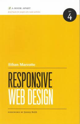
1. Responsive Web Design by Ethan Marcotte

This foundational book expands on the principles Marcotte introduced in his original article. It offers practical advice for implementing responsive design across projects.
2. Designing for Performance by Lara Hogan

This book focuses on creating fast, lightweight, and performance-optimized responsive websites. A great follow-up to Marcotte’s work.
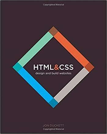
3. HTML & CSS: Design and Build Websites by Jon Duckett

This visually engaging book covers the foundational skills necessary for responsive layouts, including fluid grids and media queries.
4. Mobile First by Luke Wroblewski

Advocating for a mobile-first approach, this book complements responsive design by prioritizing the smallest screens first.
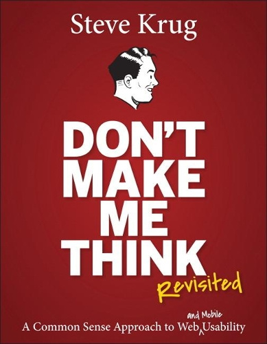
5. Don’t Make Me Think, Revisited by Steve Krug

Though not specifically about responsive design, this usability classic offers timeless advice for creating user-friendly, responsive interfaces.
Looking Forward: The Future of Responsive Design
The future of responsive design lies in adaptability. Concepts like responsive typography and context-aware components are pushing boundaries. Looking ahead, we might see designs that adjust not just to devices, but also to user behavior and preferences, leveraging advanced analytics and context-aware features like detecting ambient light.
Conclusion
Responsive design has come a long way from its humble beginnings. In 2016, it’s not just a best practice—it’s a necessity for creating modern, accessible, and high-performing websites. As technology evolves, so too will our approaches, ensuring the web remains inclusive and functional for everyone.